Web Accessibility Tools: A Guide to Compliance and Better UX
Roughly one in five people lives with a disability, and every one of them is a potential customer, reader or client. Web accessibility means building sites that everyone can use — including people who navigate with a screen reader, a keyboard instead of a mouse, or who need high contrast to read. It is increasingly a legal requirement too: lawsuits under the ADA and equivalent laws target inaccessible sites every week. The good news is that the same work that makes your site usable for everyone also makes it faster, clearer and better for SEO. Here are the tools to get there.
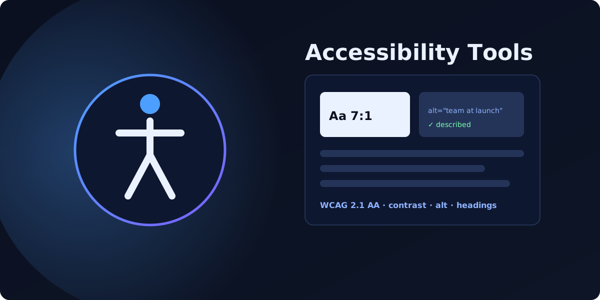
What web accessibility means — and why it matters
Accessibility is measured against the Web Content Accessibility Guidelines (WCAG), organised into three levels: A, AA and AAA. Most laws and businesses target WCAG 2.1 level AA — the practical standard for real-world compliance. Getting there is partly legal protection, partly ethical design, and partly pure growth: an accessible site reaches a larger audience and tends to convert better because it is clearer for everyone.
Top automated testing tools
Automated tools are the fastest way to find the machine-detectable issues. Three are the gold standard, and all are free.
WAVE by WebAIM
WAVE overlays icons directly on your page showing errors, contrast failures, alerts and structure. It is visual, beginner-friendly and excellent for understanding issues in context. We cover it in depth in our WAVE review.
Google Lighthouse
Built into Chrome DevTools, Lighthouse gives your page an accessibility score alongside performance and SEO. It runs the axe engine under the hood and is perfect for a quick, repeatable check during development.
Axe DevTools
Axe DevTools by Deque is the developer favourite — the same axe-core engine that powers Lighthouse and many scanners, with detailed, low-false-positive results and guided fixes.
The overlay trap
A word of caution. Accessibility overlay widgets — third-party scripts that promise instant compliance with one line of code — are, at best, a partial aid. They can add some helpful controls, but they cannot fix the underlying code: a missing form label, an unlabeled button, a broken heading order or an image with no meaningful alternative text still fail for the assistive technology real users rely on. Overlays have also been named in accessibility lawsuits. Treat them as a supplement, never a substitute for semantically correct HTML and real fixes.
The SEO and accessibility synergy
Here is the part that surprises people: most accessibility best practices are also SEO best practices, because a search engine is, in effect, a user who cannot see.
- Semantic headings — one clear H1 and a logical H2/H3 order — help screen readers and tell Google how your content is structured.
- Descriptive alt text makes images understandable to screen-reader users and lets them rank in image search.
- Strong colour contrast improves readability for low-vision users and for anyone on a phone in sunlight.
- Keyboard-operable and correctly labelled controls reduce friction and bounce for everyone.
Fixing accessibility is rarely wasted effort — it compounds into better rankings and a better experience.
Comparison: automated scanners vs manual testing
| Method | Accuracy | Time required | Budget |
|---|---|---|---|
| Automated scanners (Lighthouse / WAVE) | Catches a portion of issues — commonly cited as a third to over half — with no false confidence | Seconds per page | Free |
| Manual testing (screen readers / keyboard) | Catches real-world, judgment-based issues automation misses | Slower — hands-on per page | Free (your time) to paid audits |
The honest answer: use both. Automated tools find the obvious failures fast; a human with a screen reader confirms the experience actually works.
Four quick accessibility wins
- Write descriptive alt text. Describe the image's purpose, not "image" — and use an empty alt for purely decorative graphics so screen readers skip them.
- Audit your heading hierarchy. Exactly one H1 per page and no skipped levels; headings should outline the page, not just style text.
- Fix colour contrast. Aim for at least 4.5:1 for body text and avoid light-grey text on white.
- Test with your keyboard. Put the mouse away and Tab through the page — you should reach and operate everything in a logical order.
Want every WCAG issue found across your whole site, with exact fixes? Run a free accessibility scan, or see plans for full fix guides. For the legal side, read our guide to ADA website compliance.
FAQ
What are WCAG standards and which level of compliance does my business need?
+Do automated accessibility overlays fully protect a website from lawsuits?
+How exactly does improving web accessibility help my website's SEO performance?
+Scan your own domain free
See which of these issues affect your site — with exact fixes.
Scan Your Domain — Free